One of the more foundational experiences in a digital product is the ability to format text: creating paragraphs, adding lists, or providing emphasis for certain words or phrases. All of this adds texture to the reader's experience and helps them better understand content. And for the author, there are several established ways in which they can navigate, select, and format this text.
But what happens to the author experience when an important part of text formatting includes indentation?
This is an important situation for designers to understand because for keyboard users, indentation is always controlled by the Tab key. But this key has a far more important function for accessibility: it's the primary way these users navigate digital products. And as a result, when indentation is enabled in a text formatting experience it raises an important question:
has the user's ability to navigate the product been broken?
This is so important in fact that "not being trapped" while using a keyboard is a fundamental requirement by the Web Content Accessibility Guidelines (WCAG). But this also raises a few practical questions. If no keyboard traps are required, then
how are these traps typically handled for these experiences? And how do users discover existing exit methods?
And this is where things get a little complicated.
Existing Methods and Opaque Standards
As the industry has matured over the last couple of decades, many products have chosen to solve this challenge differently. And one important result from this is that there's no industry-wide consensus about what the right solution should be.
One existing method is to use the F6 key as an alternate form of navigation. But unfortunately, it's inconsistently used across applications and operating systems. For example, some browsers use this key to navigate between major landmarks (Firefox, Chrome, Edge) while others (Safari, Arc) do not. At the same time the F6 key may also execute other functions, such as cycling through non-landmark elements or repeating the last user action. And an important side-effect of this inconsistency is that discovering exit methods by a user is impaired. But there's something else that makes matters a little more challenging.
When looking at Success Criterion (2.1.2) more closely, there's no clear definition for what a "standard exit method" is. And as a result of this, it's also not clear when or how a user "must be advised" of an non-standard method.
I do think the guideline hints at its overall intent, that exit methods should be both available and easily discoverable. But to better illustrate how this affects users, let's look at a common situation with Google Docs.
Trapped in a Google Doc
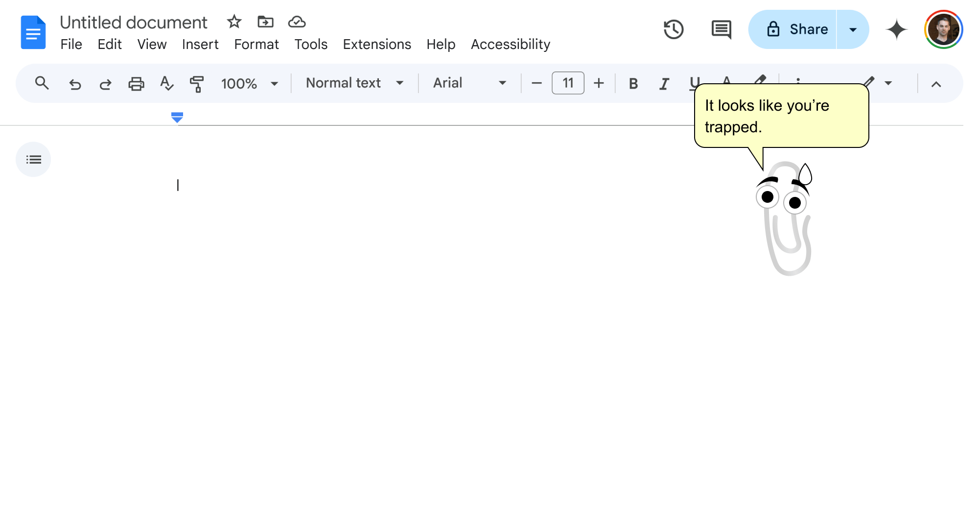
When a user opens a Google Doc, focus is immediately (and smartly) moved to the main text area for editing. If the user then wishes to move to another part of the application — say the toolbar — they can either use the F6 key or custom shortcuts to exit this text area. Except, there's a small problem with both of these methods.
Because the F6 key's functionality is not consistent it cannot be used to meet the Success Criterion, leaving the user to rely on custom shortcuts. Unfortunately, these shortcuts are also not directly communicated to users and the only way to escape this text area with a keyboard is random trial and error.

From the user's perspective this outcome is obviously frustrating. However, because of the language of the Success Criterion it could be argued that Google is adhering to the guideline as the application does technically "advise the user" — just not directly.
With this in mind then, what could we do to fix this problem?
Situations with Different Needs
When it comes to text formatting experiences that include indentation, there are two situations that users will encounter.
The most common situation is when indentation is only allowed for specific formatting options. And thankfully this situation is much more forgiving as the user always has at least one option to step away from this "trap" and return to navigation.
An example of this is Slack's primary message component. When a user adds list formatting to their text and either (1) the caret is also at the start of a list item or (2) any part of the list item's text is selected, the Tab key is rewritten to control indentation. And it's easy enough to escape these situations to re-enable normal navigation behaviors.

In contrast, the more challenging situation is when indentation is always enabled as there is no position within the text that will re-enable the default function of the Tab key. And it's this situation that needs help the most.
Creating a Better, More Consistent Solution
Indent-enabled text formatting experiences affect how users both interact with and navigate products. And I'd like to suggest a few adjustments that would both clarify how this problem can be solved, and provide a more consistent user experience.
The F6 Key and WCAG
The first change would be to enshrine F6 as a landmark navigation key in WCAG and require it to be used for this function, and this function alone. And this not only would provide a guaranteed exit method for many keyboard users, but it would also improve landmark navigation in products as well (a great side-benefit).
It should be noted however that this change cannot be the only exit method, as not every switch-based tool will include F keys (60–65% keyboards being one example).
Improving the Success Criterion
Another improvement would be to clearly define in Success Criterion (2.1.2) what exactly constitutes a "standard exit method", what "advising the user" means, and if better discoverability is the underlying intent of the guideline.
Consistent Local Interaction Behaviors
Finally, adjusting the interaction model of these experiences would be the most practical and consistent way of helping users. And only small changes are actually needed here.
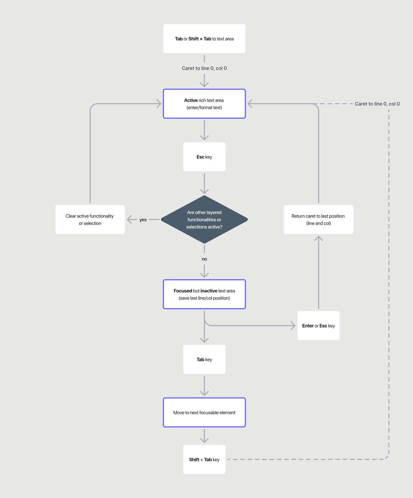
The most meaningful change would be to extend the functionality of the Escape key so that it can toggle between an active or inactive editor state. This would provide a consistent way to exit this component. And a few additional behaviors — like progressively clearing conditional functionalities or remembering the caret's last position — would also improve the overall user experience.

There's also a larger benefit to this solution as well. Because it provides a consistent model at the component level, it could also be used across any product that includes this kind of formatting experience. And this would greatly improve it's chances to be discovered — whether that's Google Docs or Obsidian, coding tools like VSCode, or many other text editing tools that exist.
And whether it's a person using a keyboard due to a mobility impairment or someone who just wants a more consistent way to navigate their environment, these changes would positively impact their experience with these indentation-enabled text formatting situations (that's really a mouthful).
Note: I've filed an issue in w3c/silver about clarifying no keyboard traps. If you feel there are additional improvements that could be made, join the discussion.