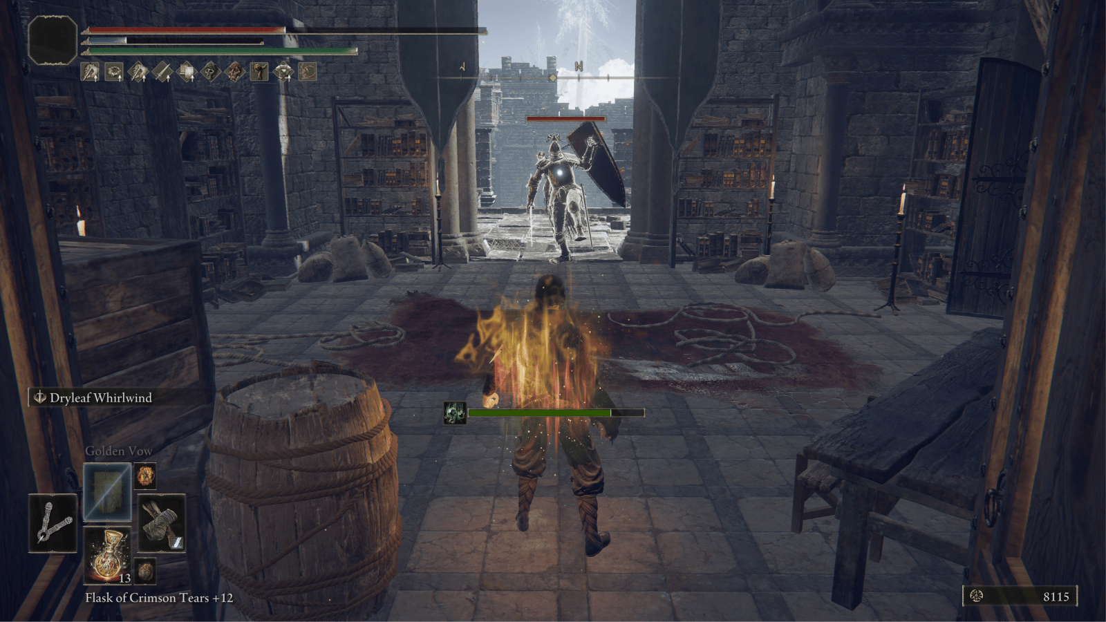
Difficulty is such an interesting topic in games. What makes something difficult? How do the mechanics that are in play help or impede players? And, when does something have so much friction that it becomes too insurmountable for the player?
In Elden Ring, difficulty is everywhere. And the most well known area of difficulty is combat, from requiring the player to precisely learn the patterns of an enemy, to how their chosen playstyle interacts with those patterns and when they can press their advantage. And FromSoftware gives players lots of tools to manage this difficulty, the most famous of which is
But using death as a learning experience isn't the only tool the player has. Players can also
- upgrade weapons,
- summon Spirit Ashes,
- play with friends, or
- use the advantages available to them via buffs and debuffs.
Generally, these tools are fairly easy to understand and use. That is… until you try to decipher what's actually going on with buffs and debuffs. And this is because the status effects produced by various equipment, items, or spells are both highly complex and also largely hidden from the player.
An interesting effect of this opaqueness is that many players turn to the community to learn how these systems work. And I certainly experienced this during my first (and second) playthrough of Elden Ring. The recurring question of "…how does this work exactly?" But it also sparked some questions in my designer brain too:
- What if this is your first game by FromSoftware, and you don't know that people have learned to use the community to decipher parts of the game in this way?
- What if you completely miss the (limited) information that does exist because of your playstyle?
But more importantly, if the vast majority of games explicitly teach players how to use their systems, how could a game like Elden Ring help players better understand buffs and debuffs? Turns out, this is actually somewhat challenging.
The Unique Challenges of Knowledge by Archaeology
One of the hallmarks of many games by FromSoftware is that players are dropped into a crumbling world where much of its history has already been lost, and it's entirely up to them to decipher what's going on. This kind of archaeological storytelling is fascinating in how it changes the way a game communicates with the player, but also it creates a pretty big challenge too.
Game mechanics aren't entirely a part of the world or its history, so how should these specific details be communicated? There are a few potential answers, but to better understand them we need to look at the player experience and what's currently difficult about it.
When Systems Withhold Wisdom
From the player's perspective there are three major questions they should be able to answer when it comes to understanding buffs and debuffs:
- What effects are currently active?
- What does this most recent effect do? And
- Have I improved my advantage overall?
And the way parts of the game obscure this information is somewhat curious.
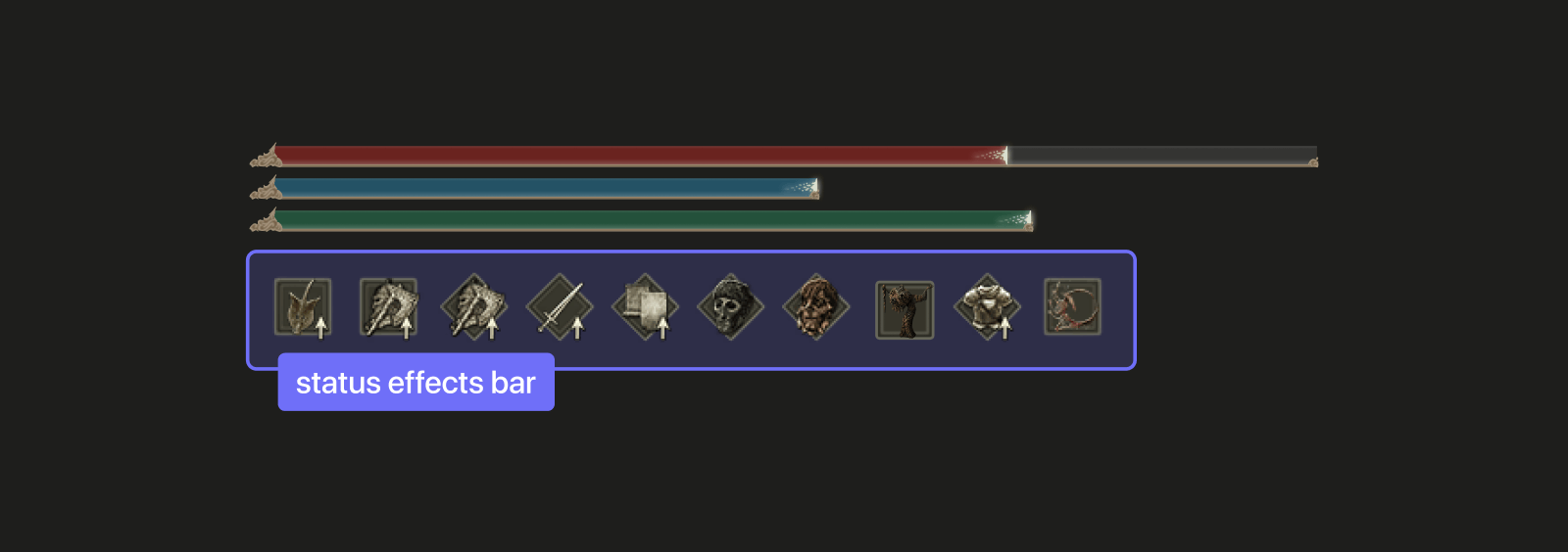
One of the most visible features to players is the effects bar in the HUD (heads-up display) that contains icons for any permanent or temporary buffs/debuffs that are active on the player. And while it's very succinct, these icons have a number of shortcomings:
- The semiotics of an icon can sometimes be very poor (never explained, too vague, over-used, inaccessible), adding difficulty to understanding what effects are active.
- Sometimes the symbol being used is for an item that the player will never find, and the intended clue that is supposed to help the player is rendered useless.
- More generally, the sheer number of effects that exist adds a lot of difficulty to learning this shorthand.
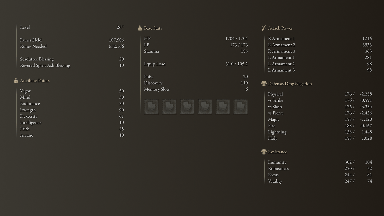
In contrast, the status screen is the most transparent and reliable tool players can use to look up the explicit effects that are currently active. But while useful:
- The design does not communicate which stats (player statistics) are currently affected or in what way (apart from Shadow Realm blessings).
- This screen also takes players out of the world to view this information. And this could lead to their death if they are trying to understand a new effect that has happened to them during an encounter.
The biggest element affecting the player however is with buffs and debuffs, and how little Elden Ring communicates how they work — from the types of buffs that exist to the many effects that can be produced. Motivated players can figure out many of these details on their own, but without help from the community the time investment to try different experiments and find worthwhile benefits is extremely high. And this risks limiting the creativity of the player.

As a result of these design choices and the friction they produce, I suspect* that a lot of players only engage with these tools in a superficial way, and never learn how absolutely broken they can make their characters. And that feels like a big missed opportunity. Especially when a recurring theme around FromSoftware games is "should this game have an easy mode?"
So I'd like to explore a few solutions that could potentially improve this experience.
* This suspicion comes from ethnography from within the community (sentiment, community discussions, content, etc…)
Helping Players With Knowledge and Feedback
When I started my examination I knew that the most important outcome to was helping players better understand how to maximize their advantage. And there were two opportunities that I felt could best drive this result:
- Provide players with the information they need to understand how these mechanics work and what effects they produce.
- Help players better understand what is currently happening (or just happened).
Providing the Right Information to Players
As I began tackling the first challenge, my first thought was "could I just communicate this information directly to the player?" Well…
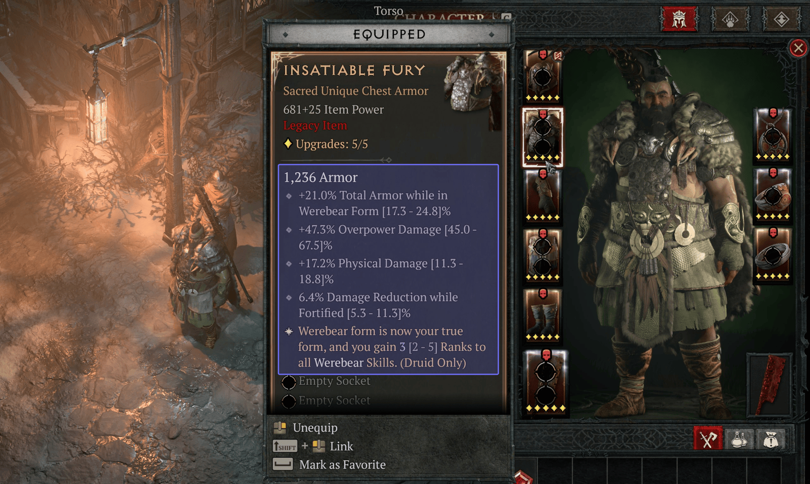
Lots of modern games would take this approach treating mechanical information as a necessary meta layer. And a great example of this is with Diablo 4 where equipment is very explicit about the (sometimes) laundry list of effects they produce. But Elden Ring is a very different game, so I needed to start with a different question altogether:
Would this approach violate Elden Ring's design philosophy?
Yes. And no.
One curious element of tension in Elden Ring are item descriptions and when that item produces an effect of some kind. Take for example the incantation Howl of Shabriri:
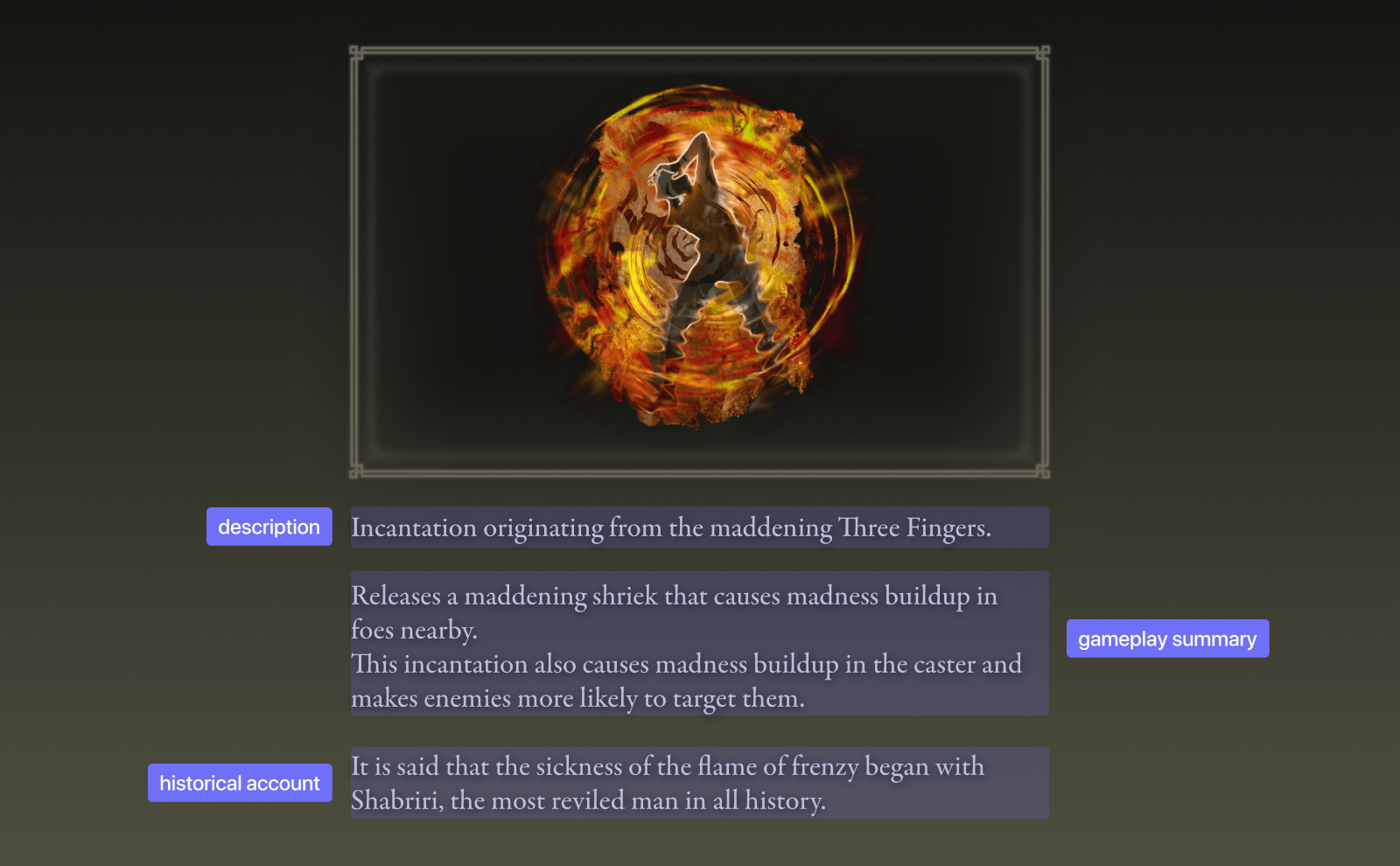
Within its item description are three details:
- a description of the physical item (the in-game artifact),
- a summary of the effects produced, and
- a historical accounting of something related to this item.
And this is generally consistent across items, equipment, and spells. And as a result, the game already provides at least some of this mechanical information to the player. But curiously… not all of it. And it was because of this that I had to step back and think about how changes would affect the overall game experience.
I eventually came to the conclusion that there were essentially two possible answers, and there are benefits and drawbacks to both.
Providing mechanical information directly to the player is by far the easiest and most effective way to speed up the learning process. And it also has a number of other benefits:
- The design helps players learn how the mechanics work, even if specific numbers aren't communicated (e.g. "increases attack power" vs "attack power +25%").
- It's a much more accessible approach because of how explicit it is, and as a result is more broadly appealing to gamers.
- It's much easier to maintain by developers as any changes are simple to update.
- The lowered difficulty to master these mechanics could — depending on testing — enhance the combat experience as there is much more perceivable texture around how players could gain advantages.
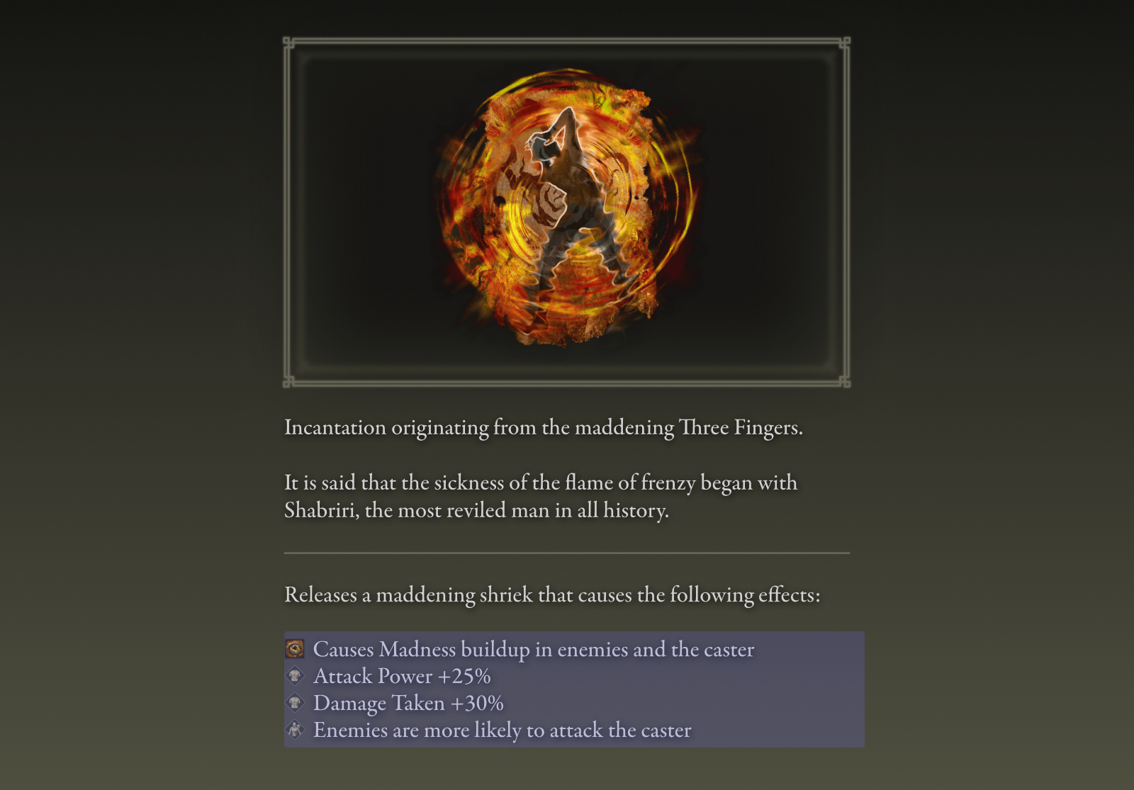
There is one potential downside to this approach however. This level of mechanical explicitness could be seen as taking away from the uniqueness of the game by being too similar to other games, like Diablo 4. And "being different" seems to be an important element to the FromSoftware community.
In contrast, a more conservative approach to this challenge is weaving the mechanical information directly into the storytelling. And this both preserves the atmosphere and feel of the game and creates a lot of opportunities for more narrative texture — for example, simulating the actual text written on an incantation and the unique point of view that could be leveraged.
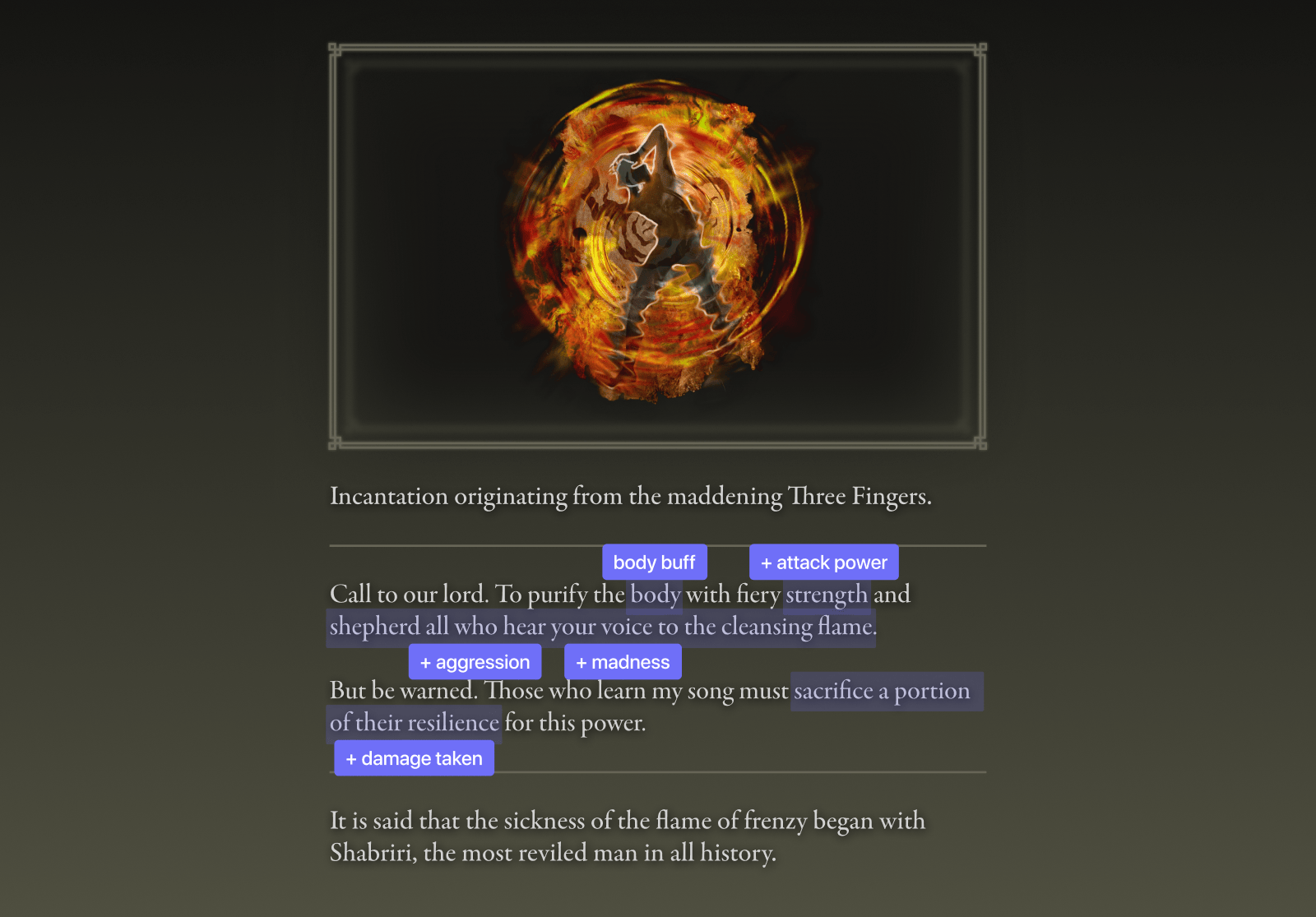
This approach however also has some downsides. First, it slows down mechanical learning in favor of the storytelling experience. And it's also much more difficult to maintain because of how exacting the language has to be (weaving in key words/phrases to build consistent hints).
But which approach is better? Honestly, I like both because of the different ways they would change the player experience; whether that's preserving the storytelling experience, or providing a quicker path to mastery over this system. But I also am very curious about how the community would react to these solutions as well.
Communicating Better Summaries in Shorter Loops
The other side of the equation is helping players understand effects by giving them better and quicker feedback loops. And creating a good player experience here is both very hard, and fairly easy to solve. Let's start with the hard.
The fastest way to help players would be to change how the HUD communicates to the player. But as I started exploring the challenges with the effects bar I realized that a meaningfully improved solution would take a lot of work as there are more than 60 unique effects (in at least 14 different categories) that can be present at any given time. And as a result, maybe I'll return to this at a later date (maybe).
What remains is the last tool that I previously noted, the status screen. And it's similar to a static character sheet in a game like D&D, mainly emphasizing long-term information. But because of this approach it falls a bit short elsewhere.

One effect of the current approach is that it de-emphasizes the use of this screen for experimentation. And because of its numbers-heavy experience, is a perfect place to bolster the learning experience. But in order to be maximally helpful, a few changes need to be made.
The first few changes can be found in the main menu. Giving the status menu item a scent when temporary effects are in play helps draw the player in more. In addition to this, changing the order of menu items and giving it a dedicated hotkey also helps players access this screen more quickly. And all these changes subtly alter the positioning of this tool.
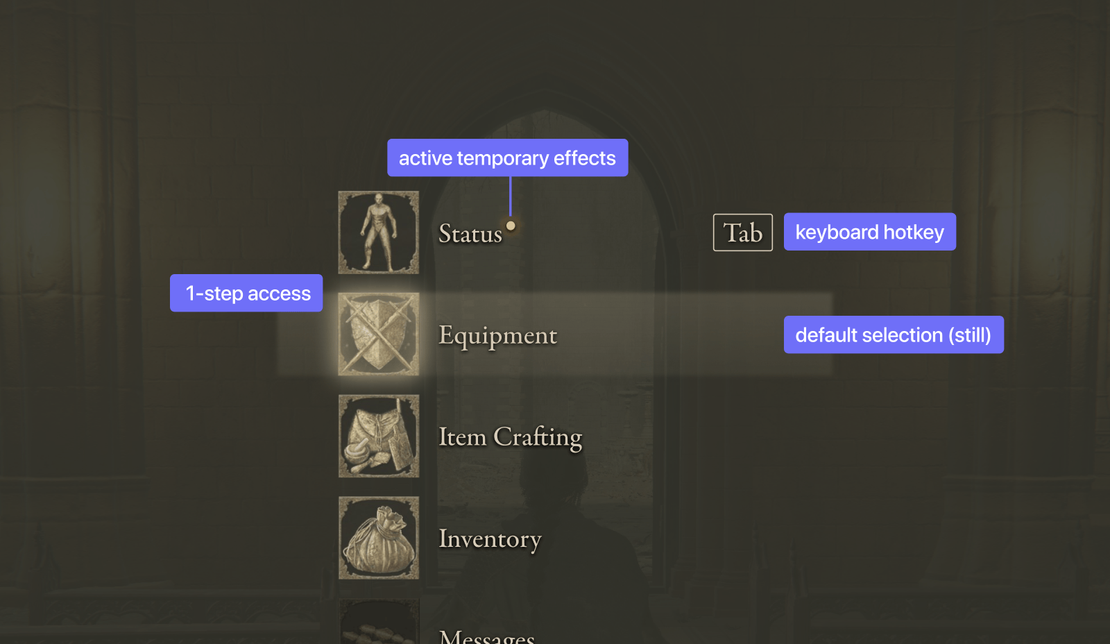
And as for the screen itself? There are several changes that help players with their knowledge.
The simplest change is that attack power and defense stats are now highlighted when they are affected by anything outside of equipment (talismans, buffs and debuffs, etc…).
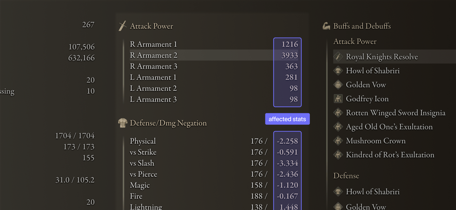
But the biggest adjustment is in redesigning the screen to include a section for the permanent and temporary effects that are active. And this change does several things:
- It aids learning by confirming how buffs and debuffs are affecting the the player.
- It clarifies information by forcing each column to focus on a specific facet of the player's status.
- The design improves experimentation opportunities by placing more emphasis on short-term stats over long-term ones.
- Players can also explicitly see which buffs or debuffs are affecting which combat stats (via 2-way highlighting).
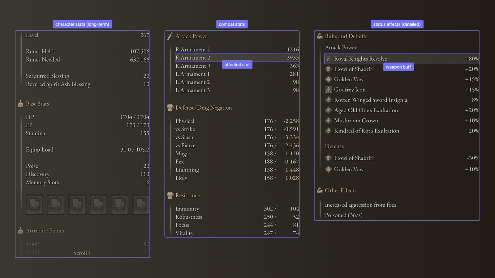
These changes greatly improve the usefulness of this screen, but there is one other detail to mention. Because all long-term stats are now in a single column, the player must scroll to view their attribute points; aided by an indicator.
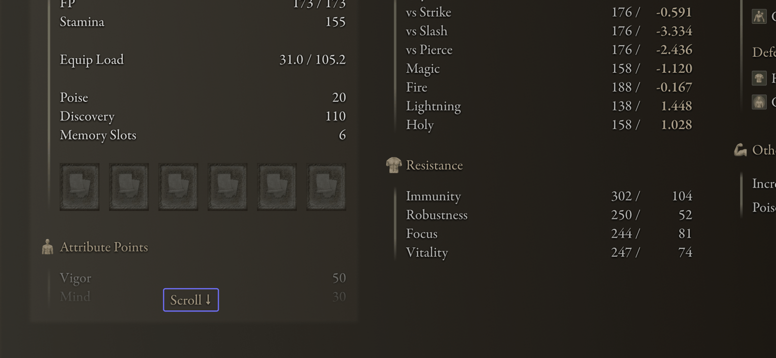
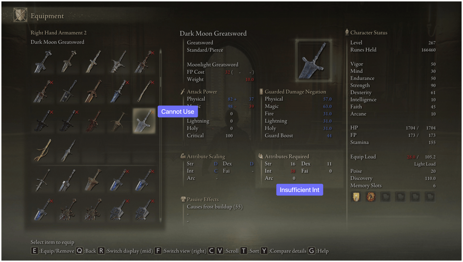
This adds some friction in the hopes that the other changes are much more valuable to the player. And thankfully, there are more direct tools that help support players when they are looking at how much of an attribute they have or need to have — for example seeing if they meet the requirements for a weapon in the Equipment screen.
More Help Leads to More Fun
The sheer amount of creativity that's available to the player via buffs and debuffs in Elden Ring is pretty incredible. And if you haven't tried to build a character that exploits these systems I wholeheartedly suggest you dive into how they work more deeply. But it was exactly because of how much these mechanical details are missing (or just deeply hidden) that I wanted to explore how the game might create a much better experience for more players. And I hope that these examples show how even within Elden Ring's current design approach that a much more helpful experience is possible.
I should take a moment to also thank the FromSoftware community for doing all of the hard work of uncovering these details so that we could all use these systems to their fullest.
