The new icon design, and the text for Team Liquid slightly cut off from view on a bright blue background.
Team Liquid Brand Update

Refining an Iconic Identity in Esports

Team Liquid is a strong brand in esports. But after using the original logo for a few years, I saw a big opportunity to address the challenges we (staff) had using it. So in 2015 I decided to tackle updating the logo.

My goal was to completely update the brand with a new logo, typeface, and colors — in a way that kept its core identity in tact. And while the latter two never quite hit the right level of quality I was aiming for, the icon was officially adopted in 2016.

The following is the work I did to improve the icon.
The old logo, with outlines on the odd shapes (manes, top chevron shape, and uneven bottom).
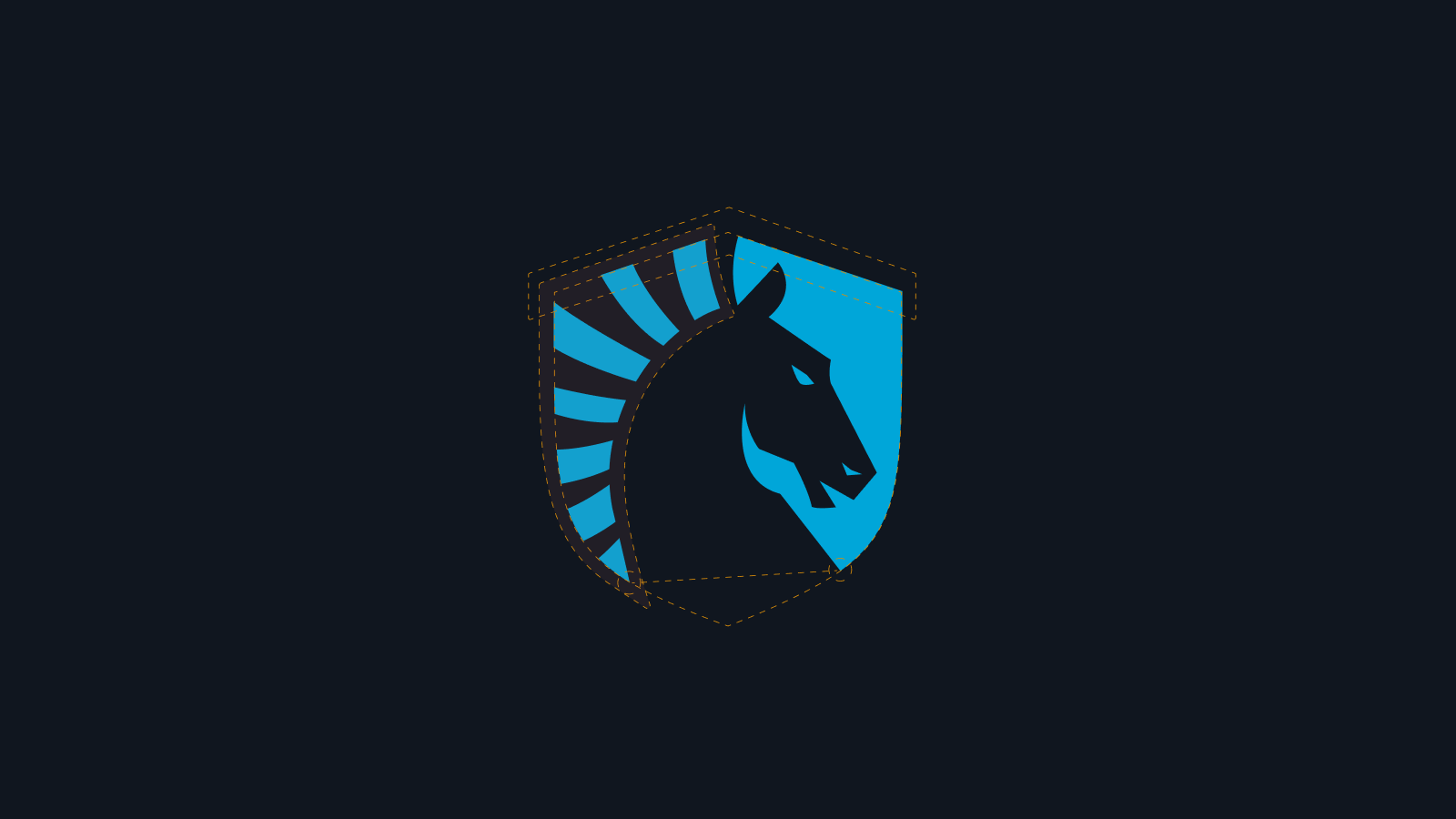
The start of the new logo, showing the many guide lines used for angles, space and porportions. The new shield background shows a symmetrical shape, while the horse itself shows many different vector points showing how it follows the shapes and guides for its result.
The new manes, showing how a single line arcs across the nape of the neck in a consistent way, producing a clean repetition.
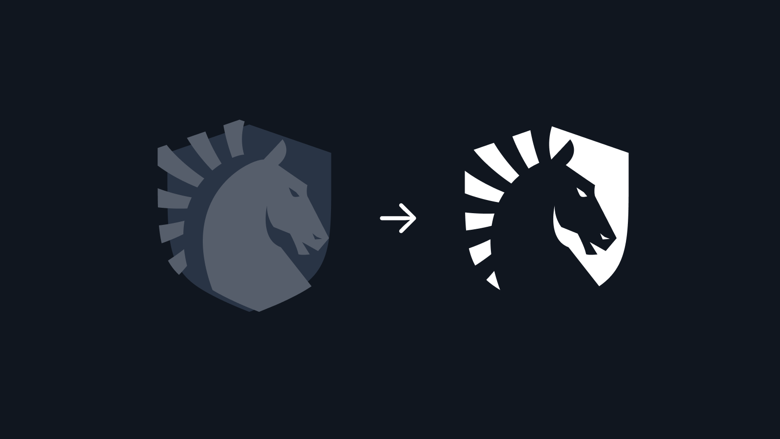
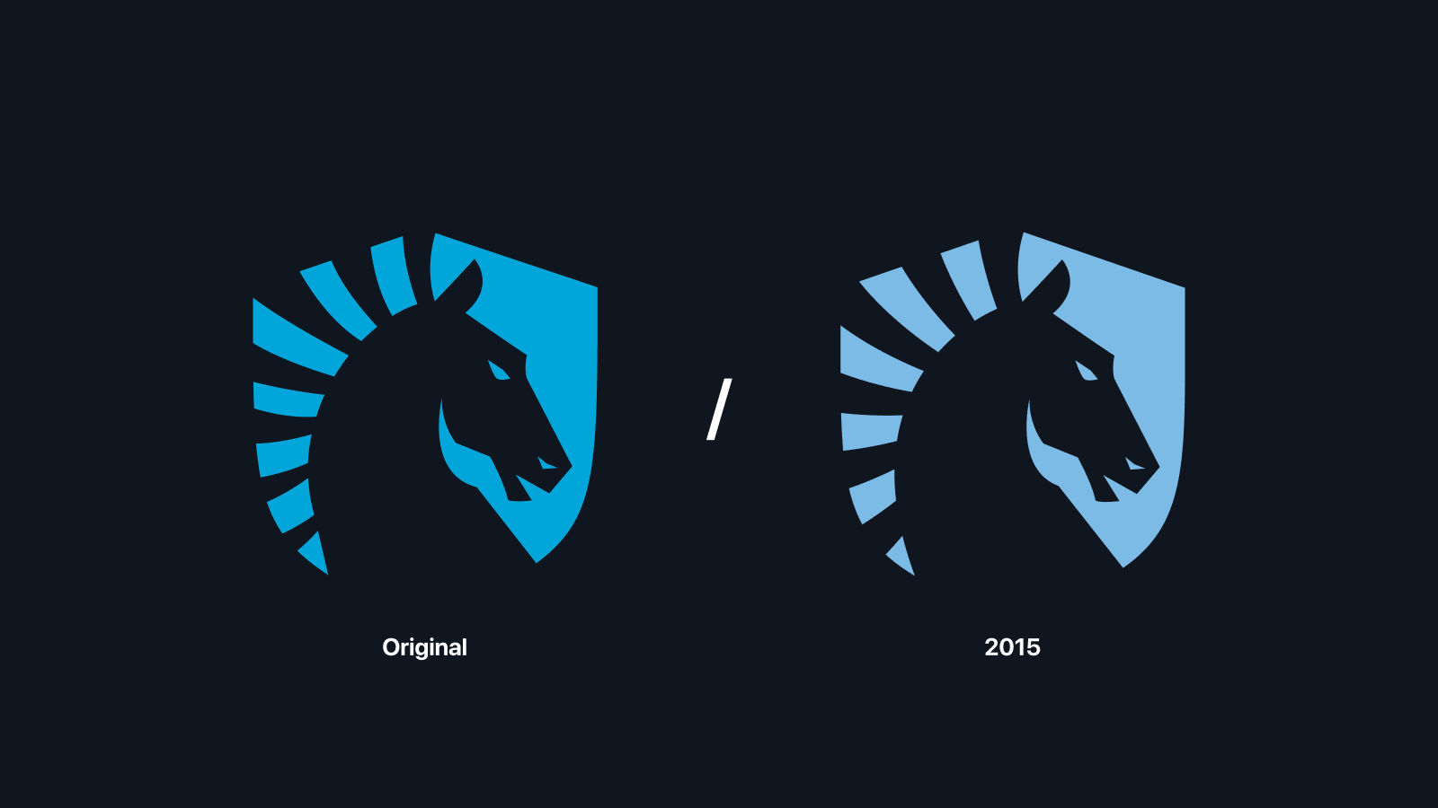
A comparison of the old and new logos, with emphasis on the changes in manes, and other adjustments.
Back to Top